Ad Stack Recommendations
Overview
With the increased complexity in digital advertising we have published this rudimentary document which shares several recommendations.
We hope the article may be exploited to maximize programmatic yield and expose as much inventory as possible to buyers - returning what's important to most publishers, happy users, happy buyers, and increased revenue.
Intended Audience
The intended audience of this article is a member of an Ad Operations, Development, or Yield Optimization team(s) of any sized publisher.
The author of this article presumes that the reader is somewhat familiar with IAB Advertising Guidelines, and has a reasonable understanding of ad slots (sometimes called ad units, or referred to as the ad size).
This article may not have all the information relevant to your specific site, implementation, ad stack, and so on, and is meant as a general guide.
Goals
Below is a simple set of goals which we believe should be kept top of mind when developing new functionality and keeping a good balance between monetization and user experience.
- Monetize My Web Site
- Keep Users Happy
- Entice Buyers
Ad Slots
Your client side ad slots are possibly the most important thing to consider when choosing how to monetize your web site.
Too many ad slots and you might annoy users, as well as make too many requests for the available demand, resulting in lower fill % for the total ad requests.
Too little ad slots, especially for popular sites with good users, may result in failure to monetize as there might be additional buyers willing to bid on compete for additional inventory.
A fine balance must be reached between keeping users happy with the ad load and providing enough inventory to buyer.
Our recommendations align with Google's Better ad standards resource which goes in depth regarding why that lucrative ad format may not be wise for user experience.
Best Practices
No matter what implementation you use we have some best practices to keep in mind when.
- Think like a user
- When you visit your web site are you able to reach content?
- Do any ads get in the way of what you want to read, watch, or do as a user?
- What about any survey or newsletter popups, are you half-way into reading content and suddenly something interrupts your experience?
- Ask a friend to visit your site and watch them navigate around, does anything get in the way of their enjoying your site's content?
- Request ads what you intend to show (as soon as possible)
- Some publishers might think that they can insert 5 ad slots into a particular article page. However, one of the ad slots is so low below the fold that users never reach it during normal use. While you will make revenue on this ad slot, it might reduce your viewability ratings and buyers paying attention to these metrics (or enforcing minimum viewability) may begin avoiding your web site.
- Requesting too many ads and caching them may also present concerns, for example, say you're a publisher which lazy loads and you have defined 10 maximum ad slots for your lazy loading - if you request all 10 ad slots but the user only ends up rendering 2, then you've reduced your fill% and possibly yield as the highest CPM bid response may be in an ad slots which never had the opportunity to render to the user.
- Simple is usually better
- Complex implementations with lots of wrapping Javascript might seem like a good idea but if you start breaking debug functionality you might put yourself in more trouble than its worth
- A good example is Prebid, if you alter the namespace and standard troubleshooting functions are now unique only to your sites it may result in reduced or delayed support from not only our team, but also any other partners you are using.
- Additionally, heavily obfuscating your ad functions and their purpose may delay support if someone has to reverse engineer your ad stack in the event something is needed.
Desktop Web
The two most common Desktop monitor resolutions as of publishing this article are 1920x1080 (1080p) and 1366x768. 1920x1080 being more common for gaming computers (Source), and 1366x768 more common for general computing (Source).
As such we will consider these two resolutions as the sizes we will consider Desktop (and laptop at 1366x768) in order to provide examples with popular sizes implemented by users everywhere.
Note: The screen resolution may not necessarily tell us the total available browser viewport size, however, it's usually a good indicator.
Layout
We recommend configuring ad code on page such that ads are rendered as soon as possible, or right after the user's browser has rendered your page content. Some publishers run ad code asynchronously in order to avoid any render-blocking.
- 50% of the rendered ad slot should be visible on initial view to increase viewability numbers, ideally trying to keep the ad in view for 2 seconds.
- The Leaderboard ad slot should include as many ad sizes as your are comfortable inserting for the same ad slot. We recommend:
- 728x90
- 970x90
- 970x250
- Big box ad slots should also include as many relevant sizes are you are conformable inserting for the same ad slot. We recommend:
- 300x250
- 336x280
- 300x600
- 300x1050
- 160x600 (May push content around if not well configured and tested, include this with caution and test before pushing live)
- Some publishers also include Native content or Banners in between articles in article lists, or within long-form content such as article pages.
Example
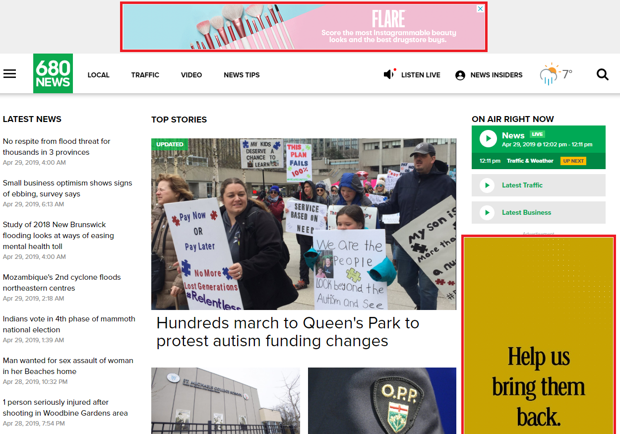
Below is a good example of a common homepage layout with a configuration similar to our layout recommendation.
The ad slots are outlined in red and immediately visible on page load.
;
Mobile Web
Mobile implementations must make additional considerations to ensure ads are visible while not impacting UX.
With limited real estate it is not always possible to ensure ads are in view, however, popular mobile ad sizes may be exploited.
Smartphone
Layout
We recommend configuring ad slots on page such that a leader board and big box are rendered as soon as possible after the user's browser has rendered your page content.
- 50% of the rendered ad slot should be visible on initial view to increase viewability numbers, ideally trying to keep the ad in view for 2 seconds.
- Mobile Leaderboard ad slots should include as many ad sizes as your are comfortable inserting for the same ad slot. We recommend:
- 320x50
- 320x100
- 320x150
- Big box ad slots should also include as many relevant sizes are you are conformable inserting for the same ad slot. We recommend:
- 300x250
- 336x280
- 300x600
- Including Native or Fluid ads between content may be a way of increasing revenue, but this may bombard users with ads when they just want to get to content. Keeping the layout simple reduces ad fatigue and keeps users in your content longer.
Example
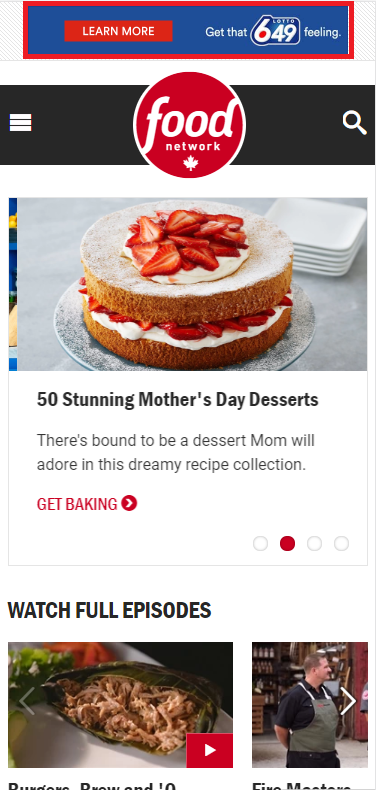
Below is a good example of a common homepage layout on a smartphone with a configuration similar to our layout recommendation.
The initial load shows a 320x50 mobile leaderboard rendered, and displays the rest of the content. This example does not make the 320x50 sticky at the top of the page, while this might impact view-ability numbers it does improve the User Experience.
Tablet
Layout
We recommend configuring ad slots on page such that a leader board and big box are rendered as soon as possible after the user's browser has rendered your page content.
- 50% of the rendered ad slot should be visible on initial view to increase viewability numbers, ideally trying to keep the ad in view for 2 seconds.
- Mobile Leaderboard ad slots should include as many ad sizes as your are comfortable inserting for the same ad slot. We recommend:
- 320x50
- 320x100
- 320x150
- 728x90
- 970x90 (Devices with ample screen real estate)
- Big box ad slots should also include as many relevant sizes are you are conformable inserting for the same ad slot. We recommend:
- 300x250
- 336x280
- 300x600
- Including Native or Fluid ads between content may be a way of increasing revenue, but this may bombard users with ads when they just want to get to content. Keeping the layout simple reduces ad fatigue and keeps users in your content longer.
Example
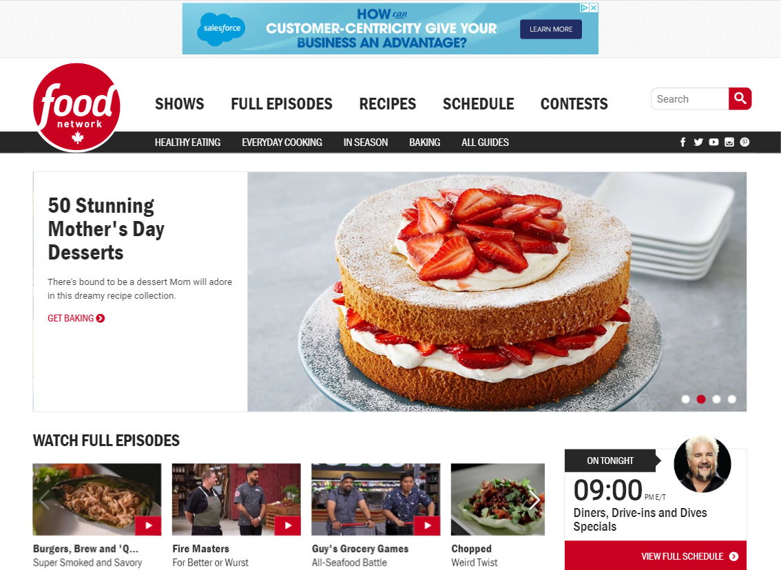
Below is a the same mobile example page using a tablet in portrait mode, a common browsing experience for users.
The initial load shows a Leaderboard rendered, and displays the rest of the content.
Video
Many publishers may want to monetize their sites with Video demand. Considerations should be made to ensure the user experience is not jeopardized.
In-Banner
When introducing in-banner video demand to your site we recommend ensuring that any demand you include does not allow any auto-play sound and creatives adhere to the LEAN Ad Standard.
It won't be possible to review every programmatic ad coming from every programmatic demand source, but if your demand partners can assure you their In-Banner won't auto-play with sound and will be of minimal bandwidth use it can provide peace of mind as a publisher.
Outstream
We recommend any and all Outstream implements enforce autoplay with sound-off to ensure the best user experience. The last thing you want is for your users to get an ad playing with max volume .
Here's an example of an implementation using Prebid, sound is available on mouse-over.
Instream
Instream video presents many more challenges to overcome as a publisher, most publishers with long-form instream content not only have to deal with DRM but also ensuring their ad load and user experience does not lead users to ad-blocking, or worse!
As such we do have some general recommendations for a good instream experience, mostly taken from the experiences of the author and discussions internally regarding what we like and don't like about streaming sites.
- Short Content (News, Blog-roll, etc)
- Try to keep the total pre-roll ad length well under the total content length
- No one wants to see 2x30s ads prior to viewing 90 seconds of content.
- We recommend a single 15/30s ad spot before 90 seconds of content.
- Publishers with lots of very short content should consider enforcing skippable ads, not showing ads, or augmenting this short content with surrounding display ads.
- Mini-Players
- Some publishers use a mini-player to continue showing the content as the user scrolls through content.
- We believe this is a great way to keep the ad and content in view.
- Auto-play with sound is fine here, however, the video player should be in-view and center-stage (Autoplay with sound out of view is usually a policy violation with most, if not all, video demand partners)
- Try to keep the total pre-roll ad length well under the total content length
- Long Form Content
- Try to keep mid-roll breaks under something manageable.
- If you're serving ads and content on a mobile device you don't want users to bounce or watch content elsewhere, if it's within your means try A/B testing a reduced ad-load to see if there's a revenue impact when improving UX.
- If you're serving ads and content on a desktop device you're probably fine using 2-3 minutes of ad content in breaks of, for example, a 42 minute television episode, however, users may leave ads running and alt-tab out, reducing your viewability.
- Skippable is your friend
- In order to keep users coming back to your tab and site content enabling skippable is a means of training the user to return to your content more quickly.
- Try to keep mid-roll breaks under something manageable.
Considerations
Please keep in mind any recommendations or configurations we express above may not be the appropriate solution for your business. Publishers are complex with not only user experience requirements, but also business reporting and management requirements which may collide with the expressions above.
As such we recommend ensuring that anything implemented in your network is just that, made for your network.
District M offers a wide variety of publishers site configuration, yield, and UX reviews available with clear and concise recommendations returned for your review.
Contact us for more information.
Related Articles and Further Reading
- https://www.thinkwithgoogle.com/marketing-resources/better-ad-standards/
- https://blog.bannerflow.com/display-advertising-best-practices-2018/
- https://video-guide.iab.com/digital-video-advertising-landscape
- https://support.google.com/webtools/answer/7159932?hl=en
- https://store.steampowered.com/hwsurvey/Steam-Hardware-Software-Survey-Welcome-to-Steam
- http://gs.statcounter.com/screen-resolution-stats/desktop/worldwide
- https://www.iabcanada.com/iab-standards-and-guidelines/


